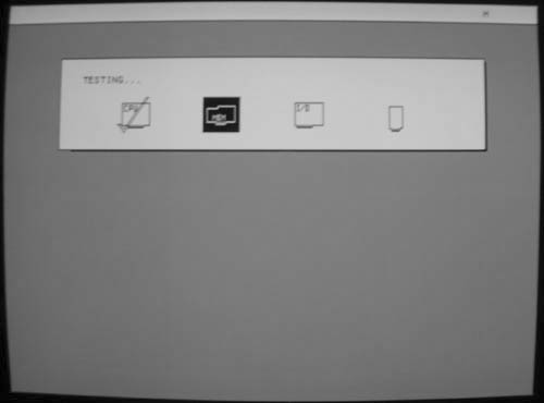
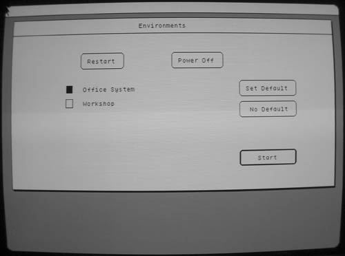
After a minute or so of waiting, the Environments window pops up. This is essentially a boot loader, and it allows you to choose between different operating environments.
As you can see, my Lisa has both the Office System and the Workshop environments installed. For systems with just the Office System installed, the Environments window isn't typically shown. After checking off the environment, hitting "Start" will begin loading it.
The Workshop environment, while very exciting in its own right, isn't nearly as interesting as the Office System which we're going to be taking a look at here.
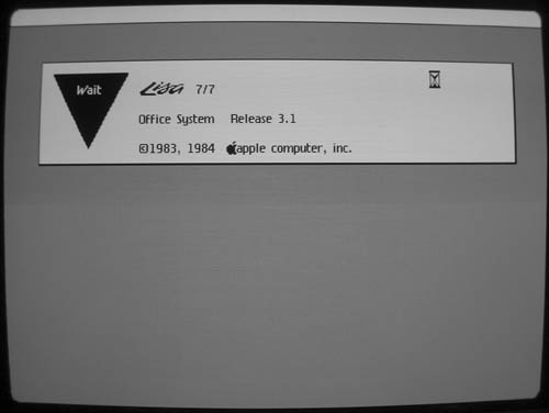
And finally, we're greeted with the actual Office System 7/7 startup screen. Not exactly "Welcome to Macintosh," but close.
While we're here, I'd like to point out the thing I love the most about the Lisa. There are lots of things to like about this machine -- its hardware was overdesigned and its software was far, far ahead of its time for 1983. Its history is fascinating. But the thing I like the most about the Lisa is:

That slanty W! I love that W! It's got Moxie. No operating system since has had the guts to have a W like that, let me tell you.
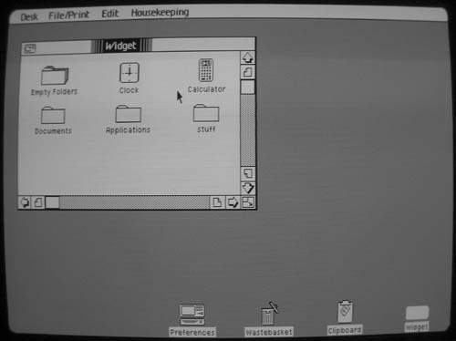
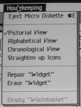
Waiting another minute or so, at last we're at the Desktop and the Office System has finished loading. What we're presented with may look remarkably familiar if you've ever used a Macintosh. You got your menu bar at the top, you got your desktop icons down there at the bottom for Preferences, the Wastebasket, the Clipboard, and the internal widget drive.
The "Widget" window is open and displays the contents of the drive. New folders are created by double clicking the "Empty Folders" icon.
Icons can be selected by clicking on them and moved to different folders by clicking and dragging. Multiple icons can be selected via the typical "rubber-band" selection methodology which has since become gospel.
Windows can be resized by grabbing the lower-right corner just as you'd expect. They can be closed ("Put Away") by double-clicking on the icon in the upper left.
In general, everything behaves as you'd expect it to in a modern GUI. There are only a few exceptions which I'll attempt to cover as we proceed.
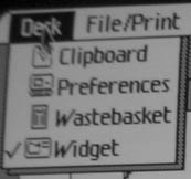
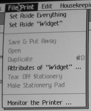
The "File/Print" menu has your standard "File" menu options with a few slightly different conventions. "Set Aside" puts whatever you're working on on the desktop as an icon. "Put Away" puts it back where it came from (on the internal drive, on a floppy, etc...)
"Tear off Stationery" and "Make Stationery Pad" make light of one of the more interesting metaphors that the Office System uses, one that hasn't been used since to my knowledge. Applications (called "Tools" in the Lisa world) cannot be directly invoked by the user by clicking on the Tool's icon as is done in modern GUIs. Instead, each Tool has its own kind of "Stationery" represented graphically as a stack of papers. To invoke LisaWrite with a blank document you "tear off" one of these papers either by double-clicking on the stack or using the aforementioned menu item. This torn off paper can then be double-clicked on thereby invoking its associated Tool. This will be demonstrated further on in the tour.
More interestingly, documents you've created in the Office System Tools can be made into Stationery themselves, acting as a template for documents created from this Stationery.
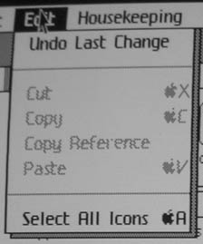
The "Edit" menu is fairly standard fare with its now universal Cut, Copy and Paste and their associated keyboard shortcuts.
I haven't yet determined exactly what "Copy Reference" is used for. On the surface, it seems to allow you to make copies of tools and put them on other disks. I'm not sure whether it's actually making a copy or if it's doing what its name implies and just placing a reference to the original somewhere else. Copy Reference will only allow copying tools, and it only allows you to put these copies on other disks.
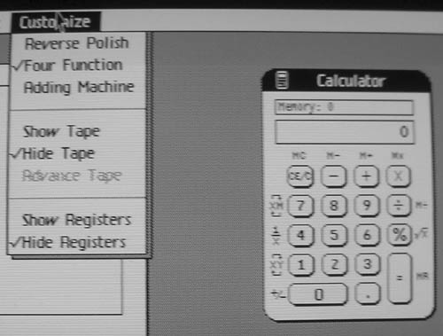
The Office System comes with a simple desktop calculator tool with a few useful options. RPN for the hardcore user, Four Function for those who don't feel like thinking in postfix. Adding machine for those who like to do a lot of adding.
Unfortunately, this calculator has one unforgivable flaw:

Above is the result of dividing by zero. 0/0 interestingly enough results in "Error." The Macintosh's desktop calculator provides the same (incorrect) results to this day. This is why the Mac has never managed to gain more than a niche market despite Jobs' best efforts.
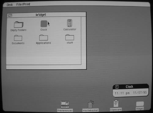
A simple clock tool is also provided which has absolutely no special features whatsoever aside from allowing you to set the time and date. What you see there in the picture is pretty much all it does. Astute readers might also notice that the date is 1995. This is not because I took the picture in 1995, and it's not because I accidentally set the date incorrectly:

I intend to pore through the Workshop toolkit source sometime to try and figure out exactly why it rolls over after 1995 as it seems to be kind of arbitrary. Incidentally, the dialog above is incorrect -- the date rolls over to 01/01/80 after passing 12/31/95. It still won't let you type in 80, though. I also have to question the logic of allowing one to type in 81 or 82 -- the Lisa came out in 1983, what possible reason would there be to allow the system clock to be set to a date previous to the Lisa's introduction?
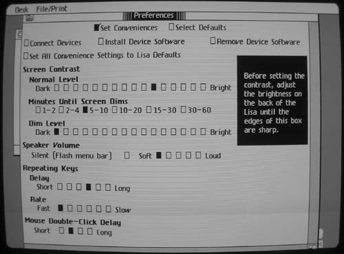
The screen contrast is software controlled as you can see and the OS provides its own screen burn-in protection by automatically dimming the screen after a few minutes of inactivity. This was later used in certain Macintosh models (the first was the Mac Classic) as well as Jobs' line of NeXT computers.
The Lisa is capable of making simple square-wave beeps through its internal speaker. I assume that it's capable of producing different frequencies, but I haven't yet found any examples to support this theory. The notification beep that the Office System uses is excruciatingly annoying, even on "Soft." Note the "Flash Menu Bar" option, an idea that the Macintosh also made use of.
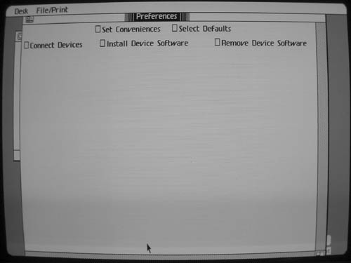
This preferences window makes obvious the one UI widget that Apple hadn't discovered yet: the "Slider" control, which might have made a little more sense than all of those checkboxes.
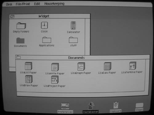
Now let's take a look at the actual Office System tools, the ones that really allow the user to do work. Going back to the desktop and double-clicking on the "Documents" folder opens up a new window. You can see that there are 7 stacks of "Paper," one for each of the 7 tools the Office System provides. These are called "Stationery" (as mentioned before), and double-clicking (or "tearing off") one of these will create a new empty piece of Paper that can be opened and worked on. For example, let's take a look at LisaWrite. If I double-click on the "LisaWrite Paper" icon, I end up with the following:
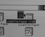
I can then double-click on this new LisaWrite Paper. This will invoke LisaWrite and after waiting for it to load, I can start writing the Great American Novel.
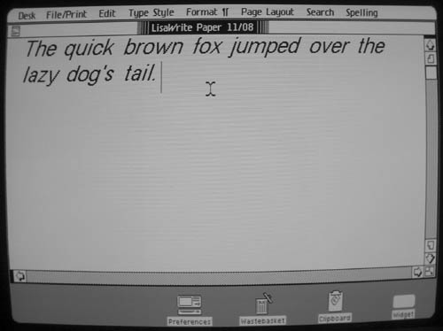
Well, I seem to have writer's block, but you get the idea. LisaWrite is a fairly basic word processor by today's standards (and from what I've read, it wasn't exactly the bee's knees in 1983 either). But it does have (as I understand it) fairly decent WYSIWYG print output and can use a multitude of fonts in various styles. Text can be, cut, copied, and pasted and it has a simple yet functional spell-checker.
All of the Office System tools are designed to work together. Generally, you can cut and paste drawings, text, or other objects from any Office tool into any other.
The Office Tools are nothing exceptional in terms of functionality, but they're generally well designed and do what they're supposed to do. The GUI interface makes certain tasks much easier for inexperienced users than on comparable text-only systems, but the major gripe with the Office System at the time was that it was incredibly slow. Similar apps running on machines with less than half the CPU power and a quarter of the memory could outrun the Lisa in most cases. This was but one of the many factors that lead to the Lisa's eventual demise.
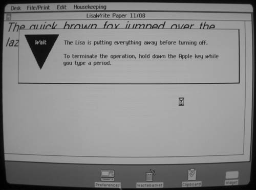
Shutting down the Lisa is simple -- you just press the power button and it will take care of the rest. The Lisa will put away anything that's being worked on. The next time you turn the Lisa on, it will restore everything to exactly the way it was when you turned it off.
Note the use of Apple-Period to cancel, later to become a standard on the Macintosh.
After a minute or more (depending on how much stuff you have open) The Lisa will proceed to power down:

And after a few more seconds the screen will fade to black, and then...
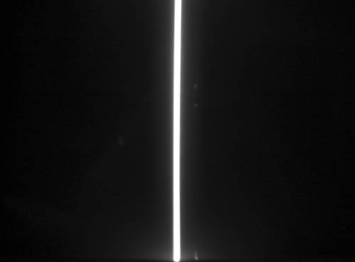
Poof! The Lisa powers itself off with a rather startling "pop" noise, leaving a bright vertical line in the center of the screen for a split second which fades away to green. I got lucky and managed to take a picture of this just as it was happening.
And so ends our tour of the Lisa. I hope you enjoyed it. Let me know if there's anything important I missed or mistakes I have made, or even if there's anything else you'd like to see covered.